Improve Your Wellbeing With Color
Spring doesn't stay for anyone, it can be a vital impulse, and here it is. As we walk through our neighborhoods with our families, a piece of yellow daffodil catches our attention. The leaves of the cherry blossom fall like snow, gather at the edges of the concrete sidewalks and surround themselves in pink. Our hands plant and care for the rich, dark soil to make the plants green.
Breathing deeply in freshly cut grass immediately creates an easier feeling of well-being, well-being and pleasure. Spring gives us longer days, more daylight and an almost instinctive cleansing instinct to make things sparkle. Green is the color of spring and the trend it brings is change, abundance and trust.
Green is our portion of physically supporting mixed vegetables; it is our financial success in the form of dollars. Luckily, choose a four-leaf clover. In these bright days, we are out of breath as everything grows and we reach for the sun in the new debate.
We, who are architects, are playing with color and bringing light into our clients' homes, trying to understand where to start and how a family and its individuals should first determine themselves. A wonderfully conceived color plot pleases the eye, but beyond the limits of aesthetics, color strengthens our identity and complements our temperament. Respect for natural light and the way we move around every room of a house during the day can illuminate our choice of color, furniture size and biophilic instincts.
COLORS
As an architect, the colors i choose for each room in the house should help us get the comfort we need to feel at home. Where does it make sense to create an atmosphere of harmony? Where can an artistic blessing increase? How can we ensure peace of mind and improvement? Which areas need a sense of cleanliness and security and which relaxing or bright colors are we most drawn to?
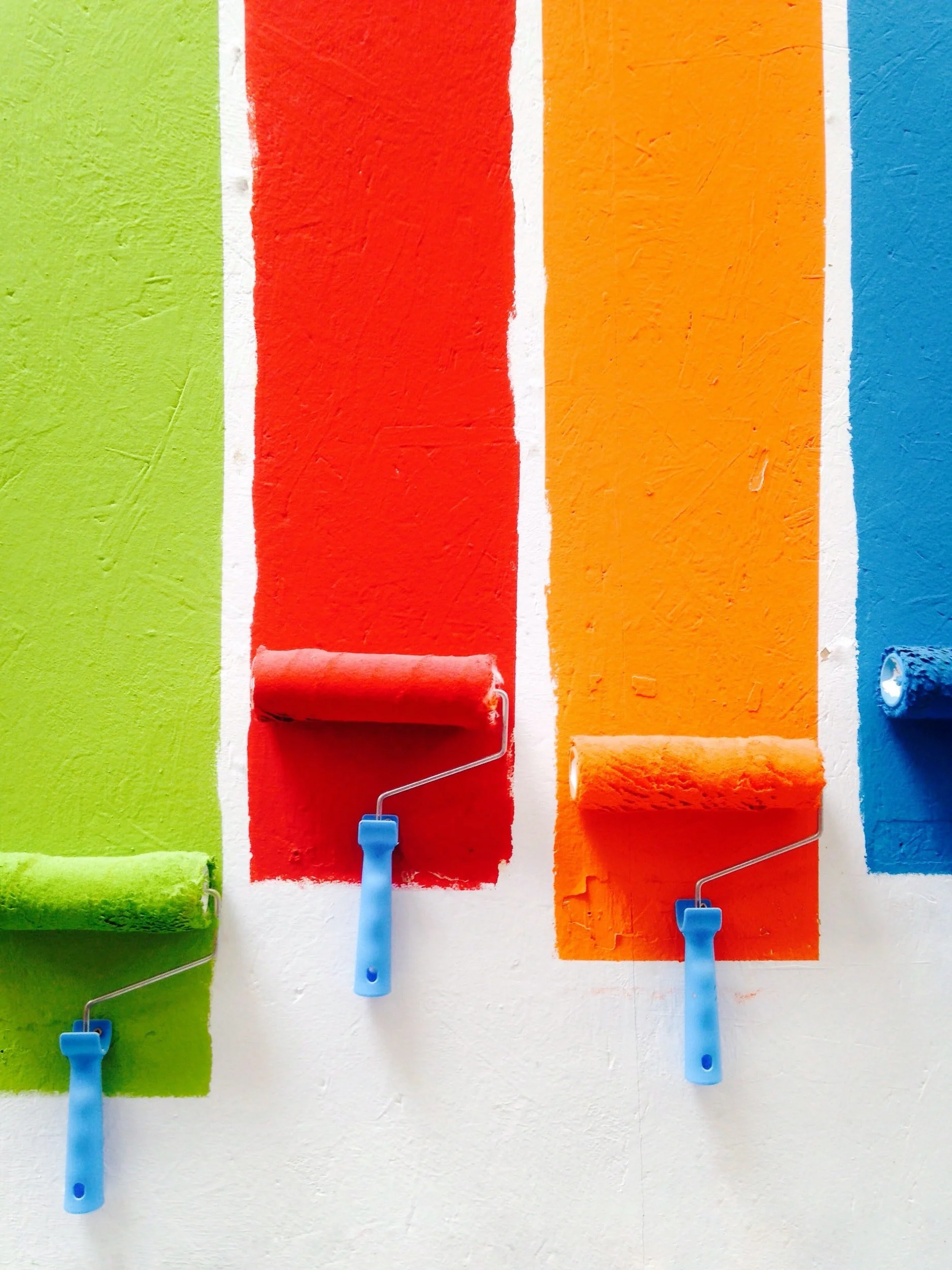
Most of us naturally feel that reds and pinks are beautiful, energetic, feminine and happy. Purple, as the monarch knew, is gorgeous and warm. The fusion of complementary colors such as blue and yellow provides instant freshness. Grays, neutral whites, browns and countless greens harmonize with most other colors. We regularly explore these modest tones in Scandinavian and moderate interiors.
However, we must consider the main root cause of each area. The color we paint on the dividers and furniture we choose something. Selected furniture, things matter to the decorations that surround us. The tones in which we decorate our furniture and accessorize a room set the tone for harmony and interaction. The color of a backsplash, countertop, floors and ceilings feeds the spirit. Where we spend time in our homes and how we spend it illuminates the color scheme and, moreover, the color chart we choose - literally - colors our taste.
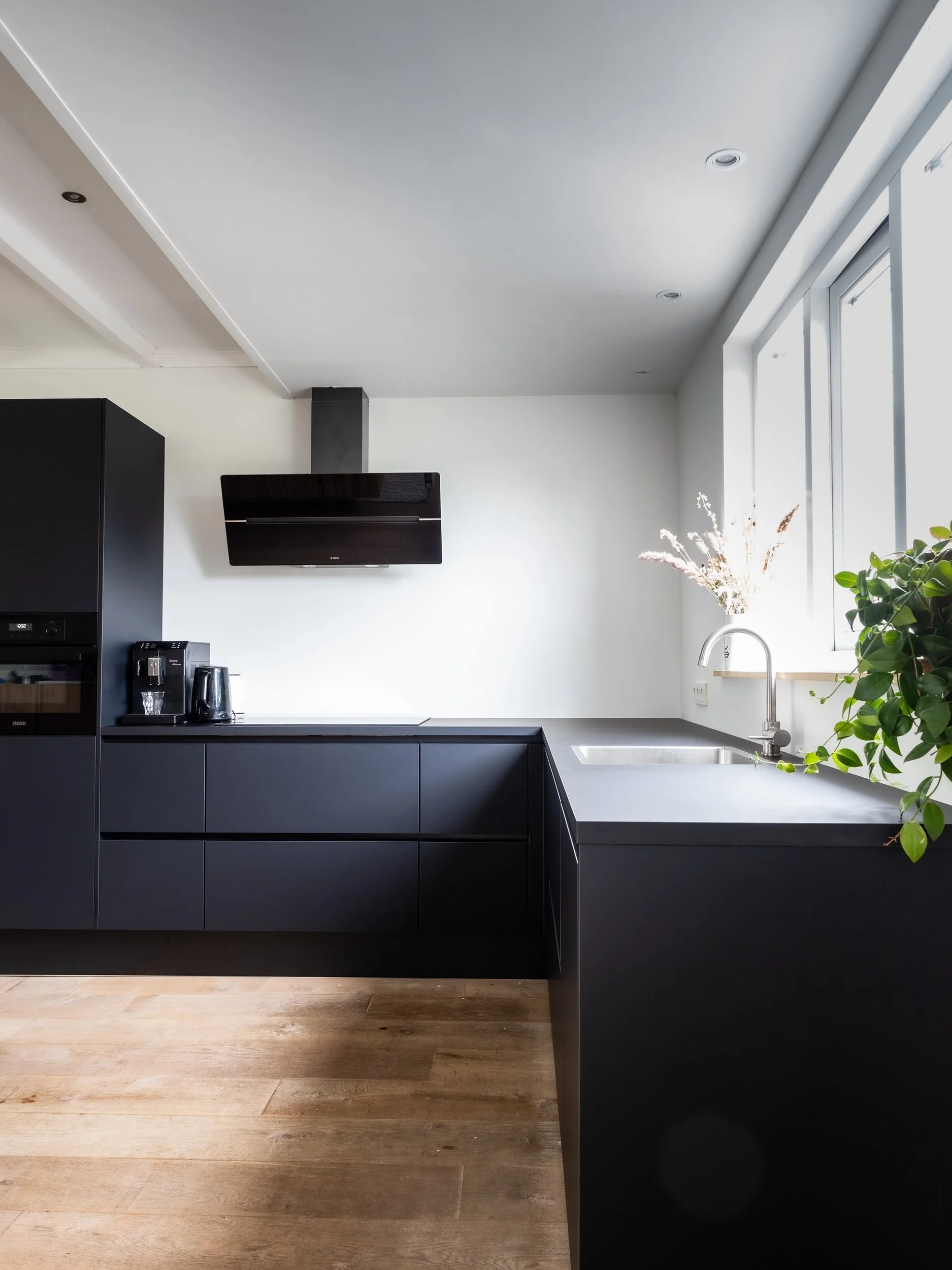
KITCHEN
We wake up and start the day in the kitchen. Our family meets here for dinner. A kitchen dominated by white allows anyone to start the day over with a clean sheet of paper and all the rationality laid out in front of them. Being a central area, the kitchen should feel and stay sanitized and the white color achieves this effect. Add surface and material with countertops that reflect light from a series of windows. Throw in some color with tiles, painted cabinets, dazzling fixtures, and a shelf to showcase the dynamic slabs you buy in Portugal. Or you can use Europe as inspiration. The cobblestone alleys in France and Italy emit a sandbox where you can almost wrap your toes. The terracotta color with its delicate orange, mud yellow and clay white tones softens time. Enjoy great nutrition, joint dinners, and gratitude for family and reunion in this tranquil palette.

WORKING AREA
Working from home these days is an opportunity to reinvent time and everything that fills us. When we scrape the absence of the square film, what will convince us to be lively, artistically oriented and productive? Natural light keeps us alert and motivated, so wherever possible, place your workspace and computer in a glare-free area and keep busy. The neutral shades of gray and white give a modern and classic look, while the effect of yellow, gold or orange impresses the visionary and creative person in us. Blue, the color of water, keeps us clean and fluid; although the light green gives us an almost spring state all year round, always in bloom.
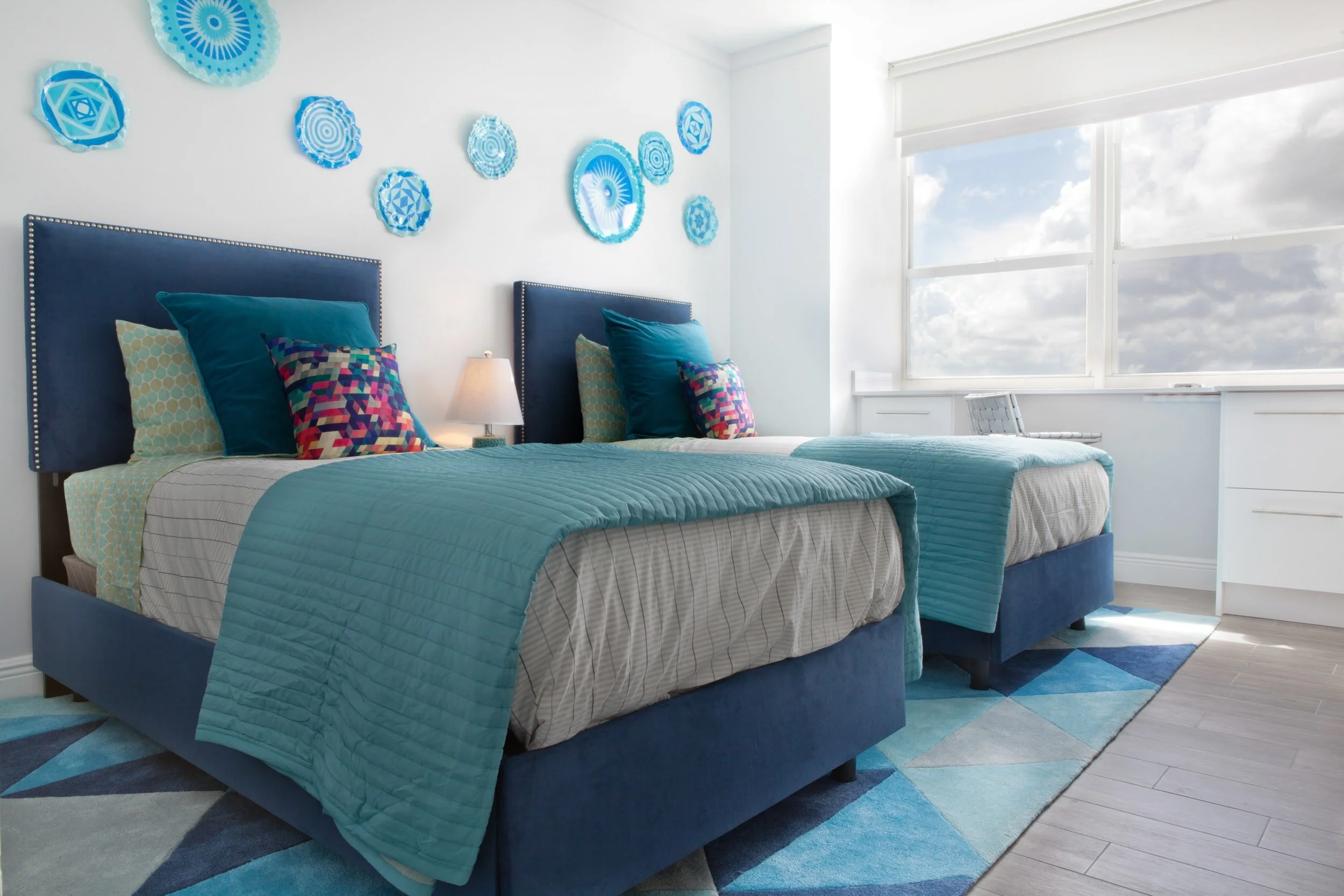
BEDROOM
And then the day ends, and whatever we understand and whatever they do, we have to give up and get well. Choose window medications that work with your circadian rhythm and create a relaxed atmosphere. Any bedroom color - dark peach, dark peach, delicate lavender, or dusty blue - will work as long as it's soft and quiet.
In fact, any color can work anywhere. But, as we walk around the house, we should feel that our space is coordinated and that in each room we feel a sense of integrity, comfort and connection.